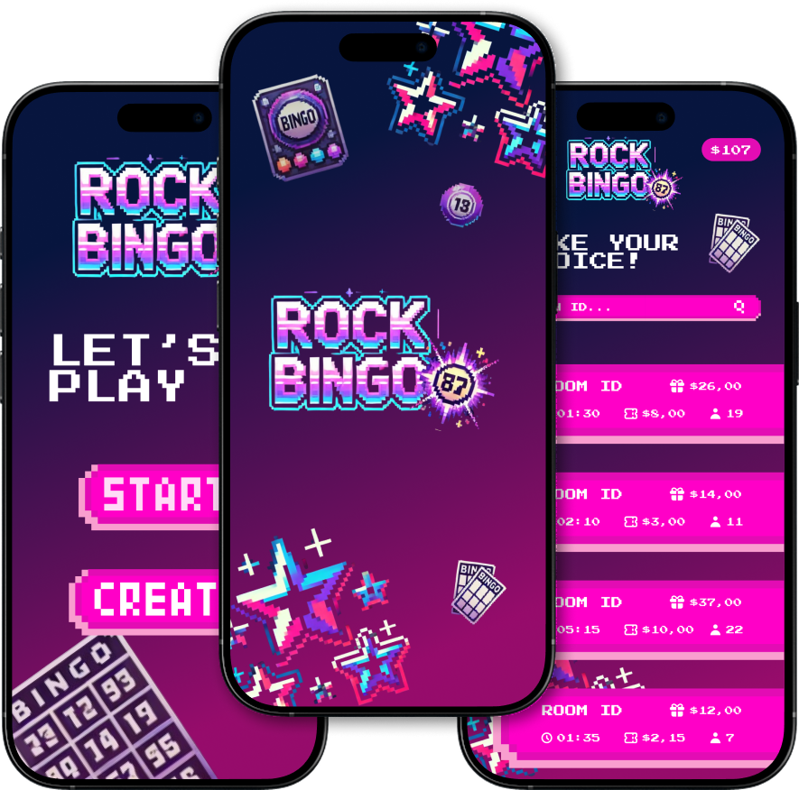
Rock Bingo was my first step into the world of design, a concept for an unfinished blockchain-based gaming app. In just two days, I designed the most essential screens, focusing on creating a fun and engaging visual style that set the tone for the project.
About My Project
Rock Bingo is a bright, energetic bingo-style game concept created for an unfinished blockchain-based gaming app. The project was developed in an extremely short timeframe, which meant there was no opportunity for sketches, wireframes, or detailed planning. Instead, I jumped straight into designing the actual screens.
This was my very first design project ever, so I was learning as I went figuring out colors, typography, spacing, and branding entirely on the fly. Even without prior experience or a predefined style guide, I aimed to create something that felt fun, modern, and visually cohesive from start to finish.
Crafting the Experience
The main goal was simple: make the game look exciting enough to grab attention instantly. Even though it was just a concept, I wanted the few screens I created to set the tone for a larger game that could eventually be built.
Because there was no time for long brainstorming sessions, I focused on:
Picking colors that felt lively and bold.
Choosing typography that was readable but still playful.
Keeping spacing clean so the UI didn’t feel crowded.
Building a mini “brand” identity in just a few hours.
The biggest challenge wasn’t just the two-day deadline — it was also the fact that I had zero prior design experience and no plan to follow.
On top of that, working with sizes was a major difficulty. I had no clear reference for proportions, spacing, or typography scaling, which made it tricky to keep elements consistent and balanced. Sometimes buttons felt too big, text looked too small, or the layout felt off — and with such limited time, I had to fix these issues as I went.
I had to:
Experiment with colors, layouts, and sizes directly in the design tool.
Make quick adjustments without spending hours refining.
Keep everything visually aligned while designing on the fly.
This approach was risky, but it pushed me to learn fast, trust my instincts, and find creative solutions without overthinking.
Since RockBingo was my first design project, my UI process was very hands-on and driven by intuition.
Because there were no early sketches, i started designing the final screens right away. My first screens were raw and experimental, but with each step, I refined the shapes, text sizes, and colors until they started to feel connected.
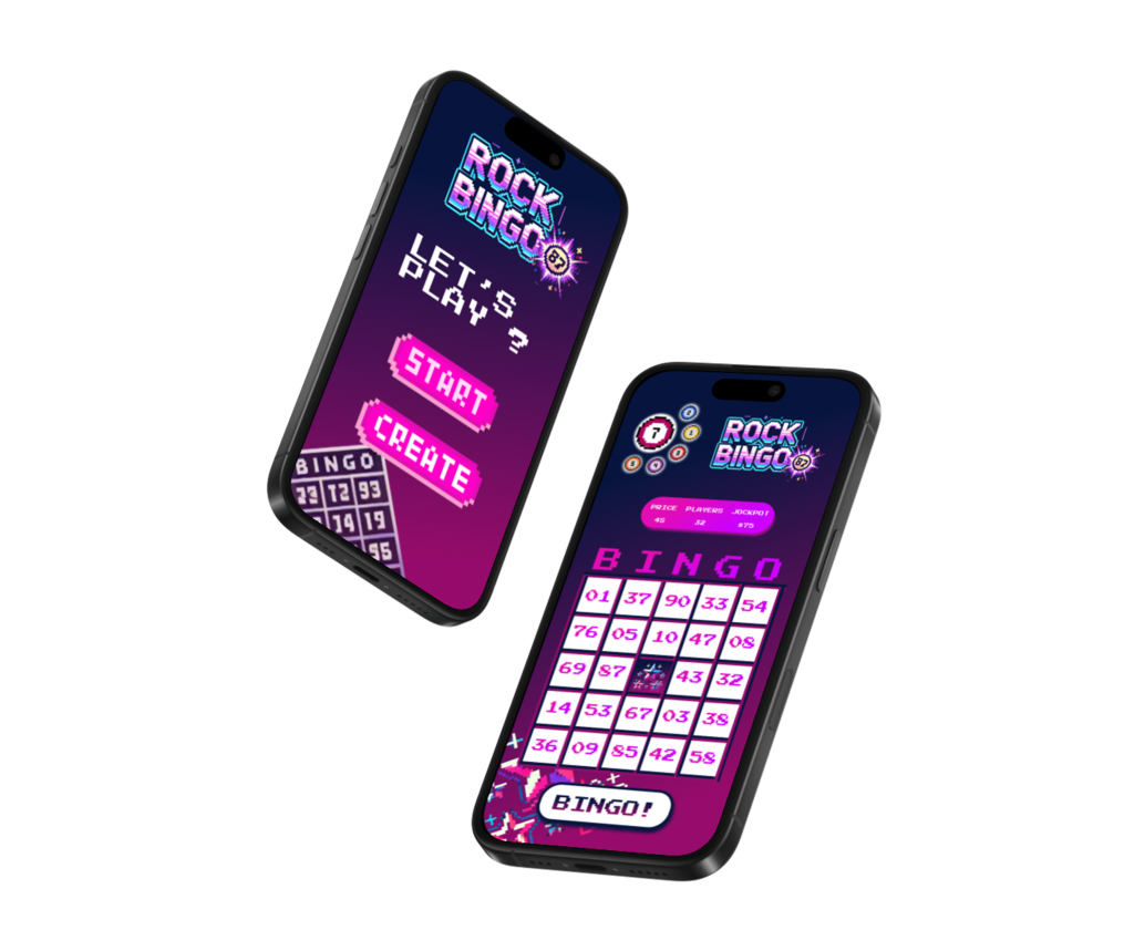
I drew inspiration from arcade games and retro aesthetics, but kept the layouts simple for mobile usability. The end result was a set of screens that looked fun, colorful, and ready to play, even though the app was far from complete.
Looking back, there are definitely things I would approach differently in RockBingo.
With more time and experience, I would:
Create a proper style guide for consistency.
Explore animations to give the UI more life.
Design more game variations and menu flows.
Test the UI with users to refine accessibility and navigation.
Documented the process more thoroughly,
Every mistake was a learning opportunity, and it helped shape the designer I’m becoming.
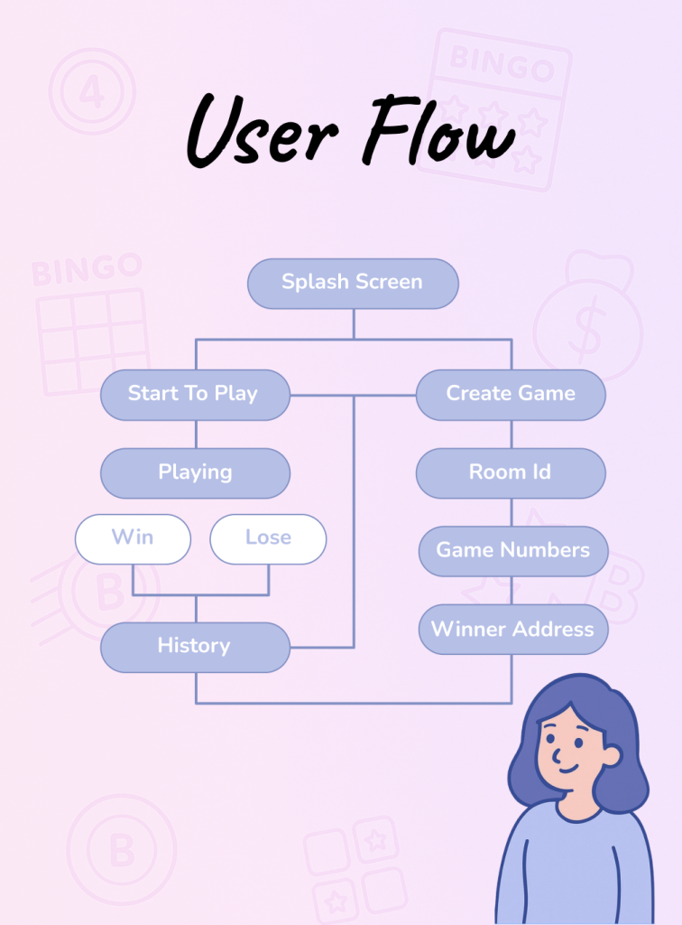
For Rock Bingo, I wanted the player’s journey to feel effortless , quick enough to get into a game in seconds, but structured so nothing felt confusing. With the short timeframe, I skipped complex navigation and focused on the most direct path possible.
It all starts with a clean, welcoming home screen where players can either adjust a few basic settings or jump straight into the action. Once in the game screen, they can interact with the bingo board, mark called numbers, and follow their progress in real time without distractions.
When a match ends, the results screen celebrates their performance, showing quick stats and a big, inviting “Play Again” button to keep the fun going. Every step was designed to keep the momentum alive, avoid dead ends, and maintain a smooth rhythm from start to finish.
What I Learned ?
Beyond learning how to use Figma and build interfaces, I started understanding the importance of usability, visual hierarchy, and consistency. I realized that good design isn’t just about how things look, but how they work and how they make people feel.
I had to quickly find ways to make the experience both fun and functional. That taught me to prioritize clarity in the user flow and to think like the person using the app, not just the person designing it.
Most importantly, RockBingo gave me confidence. It showed me that even without formal training, with curiosity and dedication, I could turn an idea into something real.
Prototype
This was a simple, mobile-only design project focused on delivering a clear and playful interface.
Due to the quick timeline, I prioritized the core experience—designing only the essential screens needed to bring the idea to life. Some flows and UI states were intentionally left out, as they weren’t necessary at this stage.
Take a look!