Let’s Nomad


A social app for travelers to connect, share, and explore new experiences together.


Designed to simplify the nomadic lifestyle, Let’s Nomad helps users discover events, meet like-minded people, and create meaningful connections while traveling.


About  My Project


Let’s Nomad was designed from scratch with a focus on digital nomads and long-term travelers. It blends practical tools like event discovery and messaging with a playful, friendly interface to make travel feel more connected.

The Mascot


The friendly squirrel mascot was introduced to reflect curiosity and adventure, two core traits of the nomadic lifestyle. It guides users through onboarding and adds personality to the overall experience.

Research

Digging Into Nomad Life


To better understand the needs of digital nomads, I explored online communities and conducted informal interviews. A recurring insight emerged: nomads crave not only logistical support but also ways to connect socially and discover local events. This shaped Let’s Nomad into a tool focused on connection and community.

Design Goals

Build an app that blends travel discovery with social sharing.


Discover Events 

Allow users to find local events effortlessly, tailored to their current location.

Connect With Nomads

Facilitate real-time connections with fellow travelers in nearby areas..

Share Experiences

Create a space where users can document and share their travel stories visually, where each post also helps rate and review places.

Understanding the User

Building empathy through :

User Persona

Name: Francy Silva


Age: 31yo


Occupation: Remote Front-End Developer


Location: Brazil


Personality: Curious, introverted, values meaningful conversations


Frustations:

  • Most travel apps focus only on bookings
  • Feels disconnected when changing cities often
  • Finds it hard to meet new people organically


Goals:

  • Meet like-minded travelers while working remotely
  • Discover events without relying only on Facebook or Instagram
  • Share her experiences with others

Francy is staying in Japan for a month while working on a freelance project. After a few days alone in her Airbnb, she wants to connect with other digital nomads and explore local events.

She opens Let’s Nomad, checks what’s happening nearby, saves a few events to her wishlist, and ends up chatting with someone who will also attend a coding meetup. She feels more connected and excited about her stay.

Objective: Evaluate the clarity and usability of the main flows in the Let’s Nomad app, especially around event discovery and social interaction.


Participantes:
1 developer;
1 designer;
1 traveler;


Work Process:

  • Defined a minimal design system early to guide decisions.
  • Built a simplified user flow focused on key actions and logic.
  • Created reusable components and spacing rules to stay consistent.
  • Broke the project into small milestones and gathered informal feedback to stay motivated.


Observations: 

  • Users understood navigation easily
    One user didn’t notice the “wishlist” icon at first
  • The footer icons were intuitive but could be larger for easier tapping
  • Messaging flow felt simple and natural
  • The mascot added a fun, memorable touch

The user flow of Let’s Nomad was designed to feel effortless, guiding travelers from discovery to connection with clarity and ease. Every path—whether finding events, meeting fellow nomads, or sharing stories—was shaped to remove friction and keep the focus on what matters most: experiencing the world and feeling connected along the way.

UI Evolution

From Sketch to Screen

Sketch

Initial hand-drawn concepts to explore layout ideas, navigation flow, and early visual direction without focusing on details.

Low Fidelity

Wireframes built in grayscale to define structure, hierarchy, and interactions while keeping visuals minimal.

High Fidelity

Polished, pixel-perfect designs with final colors, typography, and visuals ready for development handoff.

Style Guide

Building a unified identity through icons, grids, colors, and type.

Iconography

Typography

Grids

Colors

Prototype             

From Vision to Interaction

Turning static designs into functional prototypes to test usability, gather feedback, and refine the experience before development. This step bridges the gap between concept and reality, ensuring smooth interactions and intuitive flows.


Take a closer look at my project, here’s the link to the full interactive prototype.

What I Learned ?


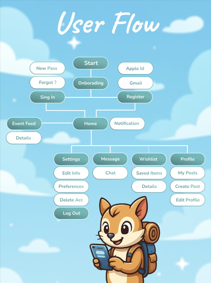
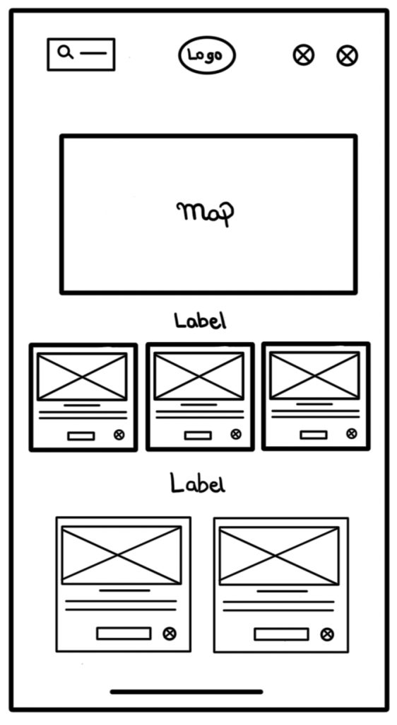
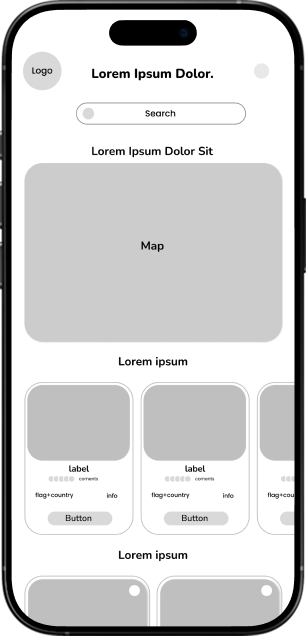
I strengthened my skills in creating user-centered designs, improving my ability to craft intuitive flows and aesthetically pleasing interfaces. This project enhanced my proficiency in prototyping, usability testing, and translating research insights into impactful design decisions.

I identified opportunities to streamline my design handoff process, improve design system documentation, and deepen my expertise in advanced prototyping tools. I also aim to enhance my usability testing methods to gather more actionable feedback earlier in the design cycle.